How to Make a WordPress Website Mobile Friendly With Elementor
Learn how to make a WordPress website mobile friendly using Elementor, including responsive layouts, mobile typography, images, navigation, spacing, breakpoints, page speed and common mobile fixes.
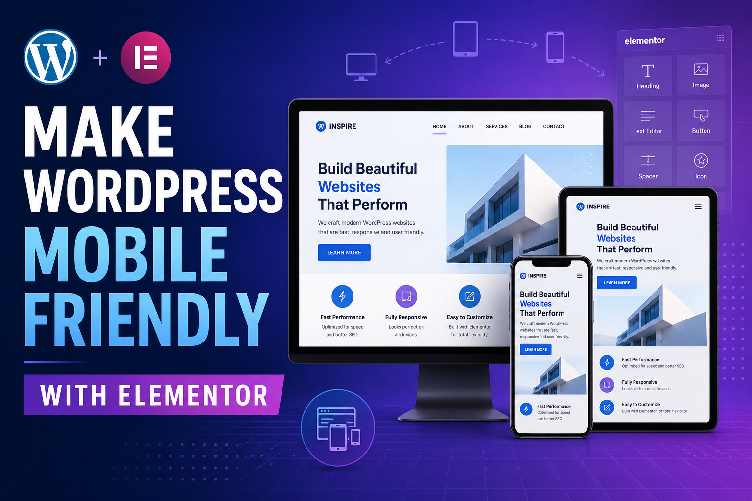
If you’re wondering how to make a WordPress website mobile friendly, the good news is that you usually don’t need to create an entirely separate mobile website.
Elementor gives WordPress users responsive controls that let you modify layouts, font sizes, spacing, widths, visibility and other design settings for different screen sizes. That means the same page can be optimized for desktop computers, tablets and smartphones.
This guide takes the core idea of building a mobile-friendly WordPress website with Elementor and updates it for today’s Elementor workflow. Rather than simply shrinking your desktop website, we’ll create a layout that actually feels natural to use on a phone.
What Is a Mobile-Friendly WordPress Website?
A mobile-friendly website is a website that remains easy to read, navigate and use when viewed on a smaller screen.
Responsive web design doesn’t simply make everything smaller. The layout itself responds to the available screen width.
For example, a desktop version of your homepage might contain three feature cards side by side. On a smartphone, those same three cards may stack vertically.
A desktop navigation menu may display every menu item horizontally, while the mobile version may turn those links into a hamburger menu.
Headings that look excellent at 60 pixels on a desktop monitor could overwhelm a 375-pixel-wide phone screen. Elementor allows you to specify a smaller heading size for mobile without changing its desktop appearance.
Before You Start: Build on a Solid WordPress Foundation
Elementor controls your page design, but mobile performance also depends on your WordPress hosting, theme, plugins, image sizes and overall site configuration.
Before optimizing your pages, make sure you have:
- A modern version of WordPress.
- An updated version of Elementor.
- A responsive WordPress theme.
- Reliable WordPress hosting.
- SSL/HTTPS enabled.
- A backup of your website before making major changes.
Need WordPress Hosting?
Your page can be beautifully responsive and still provide a poor mobile experience if the server takes too long to begin loading it.
SiteGround is one hosting option you can consider for a WordPress website. Compare its current plans, features and renewal pricing before deciding whether it fits your project.
Check SiteGround Plans →How to Make a WordPress Website Mobile Friendly Using Elementor Responsive Mode
The fastest way to begin is to open the page you want to optimize in Elementor.
Open Your Page With Elementor
From your WordPress dashboard, navigate to the page you want to improve and open it in the Elementor editor.
Switch to a Smaller Screen Preview
Use Elementor’s device controls to preview the page at desktop, tablet and mobile widths.
Select the Element You Want to Change
Select a heading, image, container, button or another element and adjust the settings that support responsive values.
Customize the Mobile Value
You can set a smaller font, different padding, alternate alignment, modified width or another mobile-specific value without necessarily changing the desktop design.
Understanding Elementor Responsive Breakpoints
A breakpoint is the screen width at which your website changes from one responsive layout to another.
Elementor’s standard workflow includes desktop, tablet and mobile views. Elementor also provides additional breakpoint controls for designers who need more precise layouts.
< 767px
767–1024px
> 1024px
You don’t need to add every possible breakpoint simply because Elementor lets you. In many cases, desktop, tablet and mobile are enough.
Add another breakpoint only when the design genuinely requires one.
How to Access Breakpoint Settings
Within Elementor, open your Site Settings and locate the layout or breakpoint controls. Depending on the Elementor editor version you’re using, the interface may appear slightly different.
You can then review the active breakpoints and customize them when necessary.
Make Elementor Containers Responsive
Modern Elementor layouts commonly use Flexbox Containers. Containers provide much greater flexibility than building separate desktop and mobile sections for every part of a page.
Suppose you have a hero section with text on the left and an image on the right.
On desktop, you might use:
Direction: Row
On a phone, that same layout can become:
Direction: Column
Now the image and text stack vertically.
Change Container Direction for Mobile
- Select your parent container.
- Switch Elementor to mobile view.
- Open the layout settings.
- Change the flex direction if necessary.
- Check the alignment and gap.
- Preview the result.
Reverse Elements When Necessary
Sometimes the desktop layout alternates images and text:
Section 1: Text → Image
Section 2: Image → Text
Section 3: Text → Image
If Elementor simply stacks these layouts, your mobile page can become:
Text → Image → Image → Text → Text → Image.
That usually feels awkward.
Responsive ordering lets you change the order so every mobile section follows a consistent pattern.
Optimize Elementor Typography for Mobile
Typography is one of the biggest reasons a desktop design looks broken on a phone.
An oversized heading may wrap into six lines. A tiny paragraph can force users to zoom. Poor line spacing can make an otherwise attractive page exhausting to read.
Suggested Starting Sizes
| Element | Desktop Starting Point | Mobile Starting Point |
|---|---|---|
| Main H1 | 48–64px | 34–42px |
| H2 Heading | 34–44px | 28–34px |
| H3 Heading | 24–30px | 21–26px |
| Body Text | 17–20px | 16–18px |
| Button | 15–18px | 15–17px |
These are starting points rather than universal rules. Your font family, weight, line height and page width all affect readability.
Check Line Height Too
For body copy, a line height around 1.5 to 1.8 often works well. Very tight line spacing makes longer articles especially difficult to read on phones.
Fix Elementor Mobile Padding and Margins
One of the most common mobile design mistakes is keeping large desktop spacing on small screens.
For example, a section might use:
Desktop: 100px top and bottom padding.
That can look excellent on a large monitor.
But placing 100 pixels above and below every section on mobile can force visitors to scroll through huge amounts of empty space.
A mobile version might instead use 45–60 pixels.
Watch Horizontal Spacing Carefully
Your page also needs breathing room along its left and right edges.
A useful starting point is approximately 16–24 pixels of horizontal padding on mobile containers.
Avoid making text touch the edges of the phone screen.
Check for Negative Margins
Negative margins can be useful for creative desktop layouts but often cause horizontal scrolling or overlapping content on smaller screens.
If an element extends beyond the mobile viewport, inspect:
- Negative margins.
- Fixed pixel widths.
- Absolute positioning.
- Oversized images.
- Long unbroken text or URLs.
- Custom CSS.
Optimize Images for a Mobile-Friendly WordPress Website
Responsive design is only part of mobile optimization. Large images can make a mobile page painfully slow even when the layout itself looks perfect.
Don’t Upload Massive Images Without a Reason
If an image displays at around 700 pixels wide in your article, you generally don’t need to serve a gigantic multi-thousand-pixel original to every visitor.
Compress Images
Use appropriately compressed images and modern image formats when supported by your setup.
Add Descriptive Alt Text
Alt text should describe what an image represents. When appropriate, naturally include relevant terminology instead of stuffing keywords.
For example:
alt="how to make WordPress website mobile friendly with Elementor responsive mode"
Check Background Images Separately
A wide desktop background photo may crop badly when displayed inside a tall mobile section.
You can adjust the background position for mobile or, when appropriate, use a different image for the smaller layout.
Make Buttons Easy to Tap on Mobile
Mobile visitors use fingers rather than a precise mouse pointer. Small buttons and closely packed links can therefore create usability problems.
Your primary CTA should be obvious and easy to tap.
For important mobile CTAs, consider using:
- Generous vertical padding.
- Clear button text.
- Strong contrast.
- Enough spacing between neighboring buttons.
- Full-width or nearly full-width buttons when appropriate.
Instead of a vague CTA such as:
Click Here
use something specific:
Start Building Your Website
Optimize Your WordPress Navigation for Mobile
A desktop navigation bar may have enough room for six or seven links, a logo, a search field and a CTA.
On a phone, that layout usually needs to change.
Use a Mobile Menu
A hamburger-style menu can keep the header compact while still giving visitors access to important sections.
Keep Your Menu Simple
Don’t make visitors dig through a maze of unnecessary options.
Prioritize the pages that matter most, such as:
- Home
- Blog
- Services or Products
- About
- Contact
Your exact menu should reflect your website’s purpose.
Check the Logo Size
A desktop logo can consume half the width of a mobile header if it isn’t resized. Set an appropriate mobile width so the logo and menu icon fit comfortably together.
Hide Elements on Mobile When Necessary
Sometimes an element simply isn’t useful on a smaller screen.
Elementor allows elements to be hidden at selected breakpoints.
Examples might include:
- A decorative desktop-only illustration.
- A duplicate CTA.
- A complex animation that adds little value on mobile.
- A visual element that makes the mobile section excessively long.
Improve WordPress Mobile Loading Speed
A mobile-friendly website should be responsive visually and efficient technically.
Visitors may be accessing your site through cellular connections rather than fast home broadband.
1. Use Quality Hosting
Your server contributes to how quickly WordPress can respond to a visitor’s request. Hosting isn’t the only performance factor, but it forms part of the foundation.
If you are still choosing a WordPress host, you can compare SiteGround’s current WordPress options below.
View SiteGround WordPress Hosting →
2. Compress Images
Images often represent a significant part of the data visitors download from a webpage. Resize and compress them before or during the WordPress upload workflow.
3. Remove Plugins You Don’t Need
More plugins don’t automatically mean a slower website, but poorly optimized or unnecessary plugins can add scripts, database work and requests.
4. Be Careful With Animations
Animations can make a page feel polished, but using too many can increase visual noise and processing work.
Use motion where it serves a clear purpose.
5. Avoid Autoplaying Heavy Video Backgrounds on Mobile
Large video backgrounds can consume bandwidth and make content harder to access. Consider using a lightweight image or simpler visual treatment on smaller devices.
6. Use Caching
A properly configured caching solution can reduce the work needed to serve frequently requested WordPress content.
How to Test Your WordPress Website on Mobile
Elementor’s responsive preview is useful, but don’t stop there.
Test on a Real Smartphone
Open the published page on your actual phone and use it as a visitor would.
Check:
- Can you read the text comfortably?
- Does the navigation work?
- Can you tap every button?
- Do images stay inside the screen?
- Can forms be completed comfortably?
- Does anything overlap?
- Is there unwanted horizontal scrolling?
- Are popups blocking the content?
Resize Your Desktop Browser
Drag your browser window narrower and watch how the layout behaves at different widths.
This can reveal awkward transitions that may not be obvious from checking only a few preset device sizes.
Common Elementor Mobile Problems and How to Fix Them
Problem #1: Text Is Too Large
Switch to the appropriate mobile breakpoint and set a smaller responsive font size. Also review line height and letter spacing.
Problem #2: Two Columns Don’t Stack Correctly
Select the parent container and review its mobile direction and responsive order. You may need Column or Column Reverse depending on the design.
Problem #3: An Elementor Element Disappears on Mobile
Check whether the widget or container has been deliberately hidden for the active breakpoint.
Also inspect custom CSS if the responsive visibility setting looks correct.
Problem #4: Website Scrolls Horizontally
Horizontal scrolling normally means an element is wider than the viewport.
Check:
- Fixed widths.
- Oversized images.
- Large margins.
- Negative margins.
- Custom positioning.
- Long URLs.
- Custom CSS using excessive widths.
Problem #5: Changes Don’t Appear on the Live Website
First make sure you saved or updated the Elementor page.
Then check caching. If the old CSS still appears, Elementor also provides tools for regenerating its generated files/data when appropriate.
Problem #6: Desktop Looks Good but Tablet Looks Bad
Don’t optimize desktop and mobile while ignoring tablet.
A two-column desktop layout may technically fit at tablet width but still look cramped. Preview the tablet breakpoint separately and adjust widths, gaps, typography and alignment.
Problem #7: The Image and Text Appear in the Wrong Order
Use the responsive ordering controls available with modern Elementor containers. You don’t necessarily need to duplicate the entire section.
How to Optimize a Mobile-Friendly WordPress Website for SEO
Making your website easier to use on smaller screens also supports a better search experience, but responsive layout alone isn’t an SEO strategy.
Use One Clear H1
Your primary heading should accurately describe the page topic.
For this article, the H1 is:
How to Make a WordPress Website Mobile Friendly With Elementor
Use Descriptive H2 and H3 Headings
Headings help visitors scan long content and help organize the subject logically.
Write Useful Content First
Don’t repeat a target keyword unnaturally. Use related terms where they make sense, including:
- Elementor mobile responsive design
- WordPress responsive website
- Elementor mobile view
- WordPress mobile optimization
- Elementor responsive breakpoints
- mobile-friendly WordPress website
Optimize Images
Use descriptive file names, useful alt text and appropriately sized images.
Use Helpful Internal Links
Link this tutorial to other relevant articles on your website, such as:
- How to create a WordPress website.
- Best WordPress hosting.
- How to install WordPress.
- Elementor tutorials.
- WordPress SEO guides.
Avoid Intrusive Mobile Popups
A popup that covers nearly the entire phone screen before the visitor can access the article usually creates a poor experience.
WordPress Mobile-Friendly Checklist
Before Publishing, Check These Items
Do You Need Elementor Pro to Make WordPress Mobile Friendly?
You don’t need Elementor Pro simply to access basic responsive design concepts. The exact controls available to you depend on the Elementor version and features you’re using, but Elementor’s editor includes responsive functionality for adapting pages to different screen sizes.
Pro features may become useful when your website needs more advanced widgets, theme-building capabilities, dynamic content and other design tools.
Should You Design Desktop or Mobile First?
There isn’t one workflow that suits every designer.
Elementor’s responsive behavior often encourages creators to establish the larger layout and then refine narrower views. However, because so much web traffic comes from smartphones, you should consider the mobile experience from the beginning instead of treating it as a final cleanup task.
Before building an elaborate desktop section, ask:
How will this stack on a 375-pixel-wide phone?
That question alone can prevent a lot of responsive design problems.
Don’t Create Separate Mobile Pages Unless You Really Need Them
In most situations, creating one responsive page is more manageable than maintaining separate desktop and mobile copies.
Elementor’s responsive containers, ordering, spacing, typography and visibility controls reduce the need to duplicate entire sections.
Duplicate content also becomes harder to maintain. You may update the desktop version and forget to change the mobile version.
Use separate versions of individual elements only when there’s a genuine design reason.
Mobile Conversion Optimization Tips
If your WordPress site sells products, generates leads or uses affiliate links, mobile optimization shouldn’t stop with visual appearance.
Put Important Information Earlier
A visitor shouldn’t need to swipe through multiple oversized sections before understanding what your page offers.
Keep Forms Short
Typing on a phone takes more effort than typing on a physical keyboard. Ask only for information you genuinely need.
Make Your CTA Obvious
Visitors should be able to distinguish the primary action from the rest of the page.
Use Trust Elements Carefully
Testimonials, guarantees and proof can help conversion-focused pages, but avoid stacking so many badges and logos that they overwhelm the actual offer.
Frequently Asked Questions
How do I make my WordPress website mobile friendly?
Use a responsive WordPress theme and page builder, adjust layouts for different screen widths, optimize typography and spacing, compress images, simplify mobile navigation, improve page speed and test important pages on real smartphones.
Is Elementor mobile responsive?
Yes. Elementor includes responsive design functionality that allows designers to preview and customize pages for different viewport sizes.
How do I edit only the mobile version in Elementor?
Switch to the mobile responsive view and change settings that support responsive values. Those mobile-specific values can override the inherited values for the mobile breakpoint.
Why does my Elementor website look different on mobile?
The cause may be inherited responsive settings, container direction, fixed widths, font sizes, spacing, custom CSS, visibility settings or elements that don’t fit inside the smaller viewport.
What is the Elementor mobile breakpoint?
Elementor’s standard mobile layout uses a breakpoint around 767 pixels, while its standard tablet breakpoint is around 1024 pixels. Breakpoints can also be customized depending on your Elementor setup.
How do I stop horizontal scrolling on WordPress mobile pages?
Find the element extending beyond the viewport. Common causes include fixed-width containers, large images, negative margins, positioning rules, long URLs and custom CSS.
Can I hide an Elementor element only on mobile?
Yes. Elementor provides responsive visibility or display controls that can hide certain elements at selected breakpoints. The exact location of the setting depends on whether you are using the classic or newer Elementor editor workflow.
Should I create a different WordPress website for mobile?
Usually no. A responsive website is generally easier to maintain because the same page adapts to different screen sizes.
Final Thoughts
Learning how to make a WordPress website mobile friendly isn’t about squeezing your desktop design onto a smaller screen.
It’s about deciding how your content should behave when space becomes limited.
Elementor gives you the tools to control typography, spacing, visibility, container direction, element ordering, widths and other responsive properties. The most important part is actually using those tools and checking your work on real devices.
Start with your highest-traffic pages. Open each page in Elementor, check the tablet and mobile views, fix the largest usability issues, publish your changes and then test the live website on your phone.
Once your core layout is responsive, improve performance, image optimization, navigation and conversion elements.
Building a New WordPress Website?
If you also need hosting for your WordPress project, you can compare SiteGround’s current hosting packages and decide whether the service matches your requirements.
Check SiteGround Pricing →Additional Resources
For Elementor interface changes and current responsive settings, always check Elementor’s official documentation because the editor continues to evolve.